Who is being left out by public transport?
An analysis of public transport quality and accessibility in Santiago, Chile
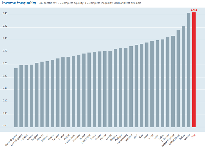
Chile is a country with high income inequality. Among OECD members, it has the highest Gini coefficient [2017] and the highest Palma ratio [2017]. Half of the Chilean workers earn $564 a month or less [2019] and the richest 1% concentrate 26,5% of the wealth [2019].
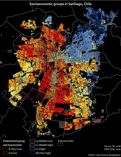
Having this context in mind, it is no surprise that Santiago (Chile’s capital) is highly segregated in terms of income. However, not only income levels are distinctly dispersed across the city, but also parks, health services, high-quality schools, and many others. Because of this, I wanted to analyze how public transport, another key aspect of urban-life, is distributed, and if there are there any communities that are being underserved.
Data
In order to understand the dynamics between the population and public transport, I gathered census data and bus and Metro schedules provided by the government.
Sources:
- Microdatos Censo 2017 (Manzana): Shapefile containing the geometry of each city block and the number of people who live in it.
- Santiago GTFS data: Standard GTFS file with information from Transantiago (public buses) and Metro.
Methodology
- Simulating the population:
Because the census data is aggregated at a city block level, I simulated as many points as people were reported to live in each city block. The points were randomized using a uniform distribution and forcing them to leave a small gap around the borders of the shape of the city block (this was done to introduce a sort of sidewalk).
- Processing GTFS data:
From the GTFS files, I obtained the location of each bus stop and Metro station and the buses or lines that run through it.
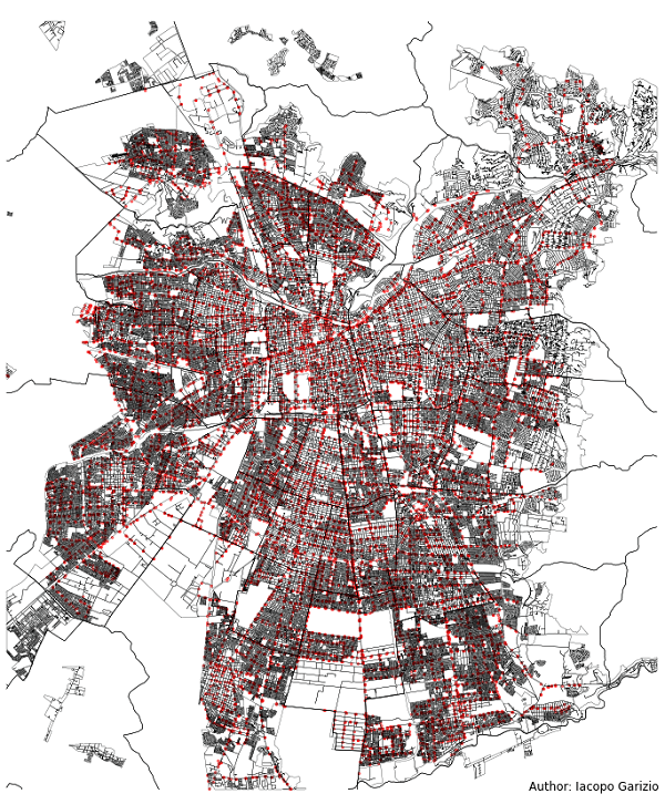
- Finding the nearest stops/stations to each simulated person:
I constructed a kd-tree (using scipy.spatial.cKDTree) with the position of the stops and stations. Using the simulated points I obtained the nearest 10 stops or stations for each person (you can see more details in the functionget_nearest_stopsof the jupyter notebook). - Calculating accessibility and quality metrics:
From the individual-level information obtained above, I calculated aggregated metrics for each city block. The objective of these metrics was to capture the level of accessibility to public transport and the quality of service that the people who live there would experience on a daily basis. This is the list of the metrics calculated and the concept they try to measure:- Average distance to the nearest stop or station [accessibility].
- Summed distance to the nearest stop or station [accessibility].
- Average distance to the 10 nearest stops or stations [accessibility].
- Average number of unique bus routes or Metro lines that run through stops or stations within 900m [quality of service].
- Average number of buses or trains that run through stops or stations within 900m (in a working day) [quality of service].
The metrics are then joined together into a single GeoDataFrame.
Findings
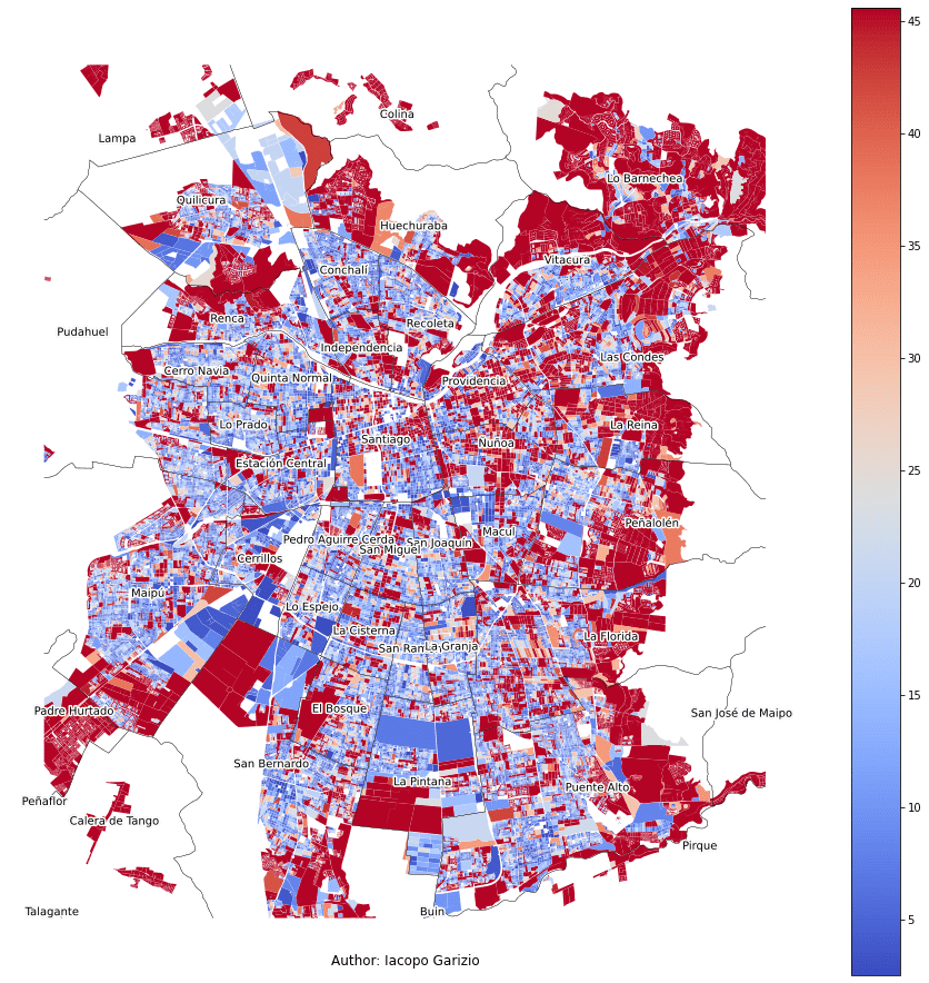
Average distance to the nearest stop or station
The average person has to walk 188 meters to get to the nearest bus stop or Metro station, which approximately translates into 3 minutes walking (assuming a conservative speed of 1 m/s)1. However, this distance can surpass the 765 meters for city blocks above the 98th percentile. Most of these are located on the outskirts.
From the map, it is also interesting to see that in almost every commune there are patches of low-accessibility, which highlights the importance of high-granularity analyses.
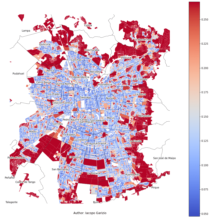
You can find a high-resolution map here.
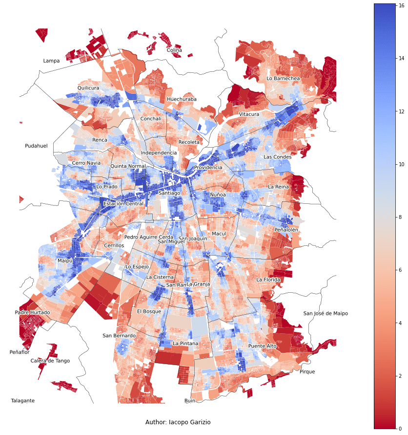
Average distance to the nearest 10 stops or stations
Following the same logic as before, the typical user would have to walk 338 meters (on average) to reach each of the ten nearest bus stops or Metro stations. When compared to the last map, this one shows a slight increase in the size of the underserved areas. The outskirts of the city are still the ones with the worst accessibility.
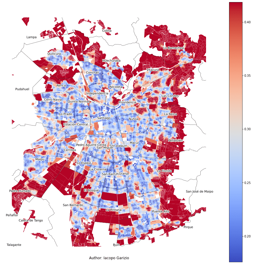
You can find a high-resolution map here.
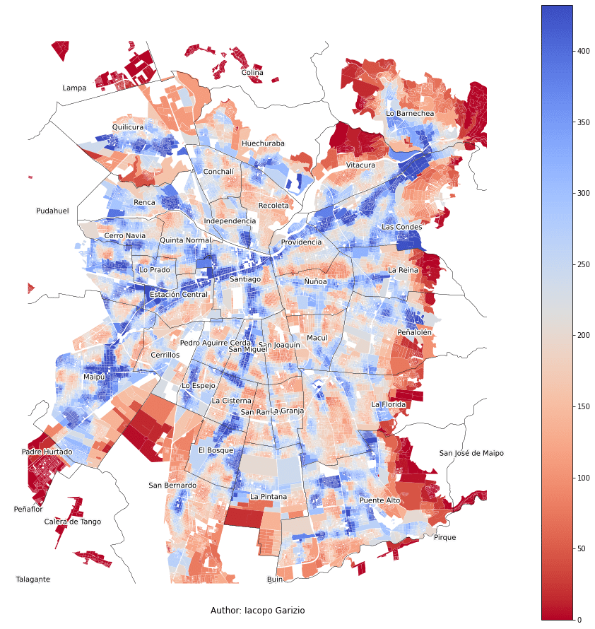
Summed distance to the nearest stop or station
As a way to try to weigh in the fact that some city blocks are more populated than others, I included a metric composed of the sum (not the average) of the nearest distances. This means that if for a given city block we see a summed distance of 45Km, the people who live in that city block would walk (collectively) 45Km to reach the nearest bus stop or Metro station.
You can find a high-resolution map here.
Average number of unique bus routes or Metro lines within 900m
As a proxy for “connectivity” (which aims to be a measure for quality of service), I included the average number of unique bus routes or Metro lines that a person can access within 900m (which, in a straight line, is a 15-minute walk), restricting to the nearest ten stops or stations.
On the average city block, a person can access 7.8 different bus routes or Metro lines. However, this is not uniformly distributed across the city. The bottom 1% of city blocks have access to 0 routes or lines and the bottom 5% to only 2, while the top 10% have access to 13.35 or more buses or lines. It should be noted that (as expected from the other maps) the outskirts of the city have the worst connectivity.
You can find a high-resolution map here.
Average number of unique buses or trains within 900m
Similarly to the previous variable, the average number of buses or trains also tries to be a proxy for quality of service. Comparing with the last map, there are not many marked differences.
You can find a high-resolution map here.
Conclusion
The analysis has shown that the response to the question “Who is being left out by public transport?” depends on what we understand by being left out. If we understand being left out as having a high distance to the nearest bus stop or Metro station, we see that the outskirts of the city and some dispersed low-connectivity patches are the most underserved. If we now consider being left out as having a low number of buses, trains, or routes available, then the only areas well-served are the ones near main roads. However, despite the differences in the results obtained by each metric, there is one group that is constantly shown as having the worst quality and accessibility in terms of public transport: the outskirts of the city.
You can find all the code here and play with an online Jupyter Notebook here
.
-
It is important to notice that this would only hold if the path taken was a straight line. For most people, this path would not be so direct. To obtain an approximation for the real distance traveled, some studies have obtained a correction factor of around 1.35. ↩